
The ListTile widget in Flutter is a versatile and powerful component that helps developers create visually appealing and interactive lists with ease. Whether you’re building a simple to-do list or a complex news feed, the ListTile widget is an essential tool in your Flutter toolkit. In this blog, we’ll explore the various aspects of the ListTile widget, providing you with a comprehensive guide to master its usage.
What is a ListTile?
At its core, a ListTile is a fundamental building block for constructing lists in Flutter. It encapsulates a single row of data in a list and can be customized to include text, icons, images, and interactive elements like checkboxes and radio buttons.
Anatomy of a ListTile
A ListTile is composed of several key components:
-
Leading Widget: Positioned at the start of the tile, often used for icons or images that provide context to the item.
-
Title: The main text content of the tile, typically used to display the primary information about the item.
-
Subtitle: An optional secondary text content that provides additional information about the item.
-
Trailing Widget: Positioned at the end of the tile, often used for icons, buttons, or other interactive elements.
Basic Usage
Let’s start with a simple example of a
ListTile:
Example:
ListTile(
  leading: Icon(Icons.star),
  title: Text('Flutter Blog'),
  tileColor: Colors.cyan,
  subtitle: Text('Exploring Flutter widgets'),
  trailing: IconButton(
    icon: Icon(Icons.arrow_forward),
    onPressed: () {
      // Navigate to the blog post
    },
  ),
)
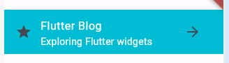
In this example, we’ve included an icon as the leading widget, a title, a subtitle, and an icon button as the trailing widget. This results in a visually pleasing list item with all the essential components.
Customization and Interactivity
The real power of ListTile lies in its ability to adapt to various use cases. You can customize the appearance and behavior of the tile according to your needs. For instance:
- Use images instead of icons in the leading or trailing position.
- Change the font style, size, and color of the title and subtitle.
- Add checkboxes or radio buttons to create interactive selection lists.
Handling Tap Gestures
ListTile can be made interactive by wrapping it in a GestureDetector to respond to tap gestures:
Example:
GestureDetector(
  onTap: () {
    // Handle tile tap
  },
  child: ListTile(
    title: Text('Tap me!'),
  ),
)
Dynamic Lists with ListView.builder
When dealing with dynamic lists, the ListView.builder constructor is often used in conjunction with ListTile. This helps efficiently build lists that only render the visible items, improving performance.
Example:
ListView.builder(
  itemCount: items.length,
  itemBuilder: (context, index) {
    return ListTile(
      title: Text(items[index]),
    );
  },
)
if want to read more about this Widget : ListTile click here
reference Link : https://api.flutter.dev/flutter/material/ListTile-class.html
Example:
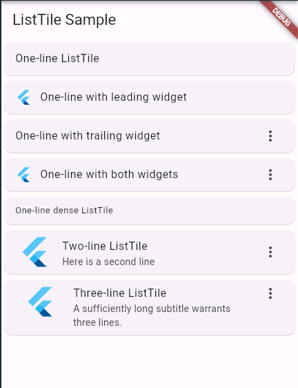
import 'package:flutter/material.dart'; /// Flutter code sample for [ListTile]. void main() => runApp(const ListTileApp()); class ListTileApp extends StatelessWidget { const ListTileApp({super.key}); @override Widget build(BuildContext context) { return MaterialApp( theme: ThemeData(useMaterial3: true), home: const ListTileExample(), ); } } class ListTileExample extends StatelessWidget { const ListTileExample({super.key}); @override Widget build(BuildContext context) { return Scaffold( appBar: AppBar(title: const Text('ListTile Sample')), body: ListView( children: const[ Card(child: ListTile(title: Text('One-line ListTile'))), Card( child: ListTile( leading: FlutterLogo(), title: Text('One-line with leading widget'), ), ), Card( child: ListTile( title: Text('One-line with trailing widget'), trailing: Icon(Icons.more_vert), ), ), Card( child: ListTile( leading: FlutterLogo(), title: Text('One-line with both widgets'), trailing: Icon(Icons.more_vert), ), ), Card( child: ListTile( title: Text('One-line dense ListTile'), dense: true, ), ), Card( child: ListTile( leading: FlutterLogo(size: 56.0), title: Text('Two-line ListTile'), subtitle: Text('Here is a second line'), trailing: Icon(Icons.more_vert), ), ), Card( child: ListTile( leading: FlutterLogo(size: 72.0), title: Text('Three-line ListTile'), subtitle: Text('A sufficiently long subtitle warrants three lines.'), trailing: Icon(Icons.more_vert), isThreeLine: true, ), ), ], ), ); } }
Conclusion
These are just a few of the essential widgets that Flutter provides to create dynamic and engaging user interfaces. By combining these widgets and exploring the broader range of widgets available, you can build powerful and visually appealing apps across various platforms. Remember that Flutter’s flexibility allows you to customize these widgets to suit your application’s unique needs. Happy coding!